AT&T · Flagship case study
Turning fragmented store intake into a connected check-in experience
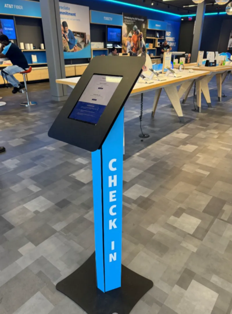
I led UX strategy for a new AT&T store intake system, replacing inconsistent paper lists and informal queues with a clearer check-in experience. Three prototype flows were piloted across three stores. Field observations informed navigation, accessibility, and queue information, while opening opportunities for QR check-in, scheduling, and connected retail service.
[NEED FROM LOGAN: confirm attribution of the supplied curbside metrics to this case, project dates, comparison baseline, timeframe, survey question, sample size, and measured versus planned integration status]
Context: AT&T
Stores used paper sign-in sheets, sticky notes, or verbal queues. A new in-store service needed a more structured intake experience.
The challenge
The team needed to design both a usable kiosk and the surrounding behaviors: visit prioritization, rep visibility, and interrupted check-ins.
The insight that changed the direction
Navigation, small fonts, glare, and slow touch response created friction. Customer names alone did not give reps enough information to triage visits.
Before / Observed context
Paper lists, sticky notes, and informal queues varied between stores.
After / Direction taken
A structured intake flow with clearer navigation and better visit information for reps.
What I did
- 01Observe inconsistent store intake
- 02Pilot three flows in three stores
- 03Refine navigation and visit information
Evidence statusPilot and iteration; curbside metric attribution pending
- Developed three flows and piloted them in three stores.
- Revised navigation, text, touch interactions, and visit information based on observation.
- Initiated discussions about QR check-in and online scheduling as connected service opportunities.
Annotated screens and user flows
[NEED FROM LOGAN: approved annotated screens or user flow for AT&T; include captions and delivery status]
Before and after evidence
[NEED FROM LOGAN: matched source artifacts showing the observed problem and the delivered or proposed response]
Outcomes and evidence
The source reports clearer navigation and a foundation for queue prioritization and cross-platform integration. The new brief supplies curbside metrics whose relationship to this store-intake story still needs confirmation.
[NEED FROM LOGAN: confirm attribution of the supplied curbside metrics to this case, project dates, comparison baseline, timeframe, survey question, sample size, and measured versus planned integration status]
Reflection: decisions and trade-offs
The kiosk was an entry point into an ecosystem of workflows and human touchpoints. The trade-off was to improve immediate intake while preparing for broader integrations, rather than treating every future integration as delivered.
[NEED FROM LOGAN: Logan’s specific retrospective on what he would do differently and the stakeholder alignment involved]